Q. Why did we update the logo?
A. After having the same logo for 25 years, it was time to refresh our logo and give it a more modern and bold look that represents the UBI brand. The new bold font will project a stronger image and be more visible. The size and shape will better accommodate imprint areas of various shapes and sizes.
A. After having the same logo for 25 years, it was time to refresh our logo and give it a more modern and bold look that represents the UBI brand. The new bold font will project a stronger image and be more visible. The size and shape will better accommodate imprint areas of various shapes and sizes.
Q. Do the changes have any significance?
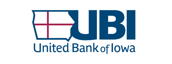
A. The updated logo maintains two very important components:
1. The state of Iowa signifying our presence throughout Iowa.
2. The intersecting bars representing the strong connection between customers, employees, and stockholders.
Because we are more commonly referred to as UBI, we have added the UBI acronym prominently in the updated logo.
Q. When will you start using the new updated logo?
A. The updated logo is being introduced in the September, 2021 newsletters and on Facebook and website starting September 3. Printed materials, promotional items, and signage will be updated as advertising is renewed, supplies are replenished, and time allows. This process will take a year or more.
A. The updated logo is being introduced in the September, 2021 newsletters and on Facebook and website starting September 3. Printed materials, promotional items, and signage will be updated as advertising is renewed, supplies are replenished, and time allows. This process will take a year or more.
Q. Are you keeping the same tagline?
A. Yes, our tagline will continue to be The Difference is Here.
A. Yes, our tagline will continue to be The Difference is Here.